k = 50  #convection coefficient (cal/h/ºC)
a = 18 #air temperature (ºC)1 Ecophysiology and the climate space: when to bask in the sun?
We are now almost daily bombarded with news about climate change and its impacts on people and ecosystems. But how does climate mechanistically affects organisms? The basic foundations to address this question were laid out by ecophysiology research. Interestingly, at the time that some of seminal research on ecophysiology was carried out, back in the 1940’s (see review in (Huey 1982)), climate change was not yet in the radar of most people. The research was driven by the interest in the basic understanding of how biophysical conditions affect organisms. Today the knowledge gained from this research has acquired new importance. This is an area whether the mechanistic knowledge learnt from theory and experiments is now sometimes overlooked because of the massive datasets and machine learning approaches available. But let’s start with the basics.
1.1 A model for the body temperature of an animal
Animals can be divided in two big groups in regard to the way they regulate their temperature: ecoctherms and endotherms (Figure 1.1). Endotherms such as mammals and birds are able to regulate their temperature by producing heat through metabolism. Ectotherms in contrast must regulate their temperature by obtaining heat from the environment. By obtaining energy from the environment, ectotherms have lower energy demands than endotherms, which have to be burning energy all the time to keep their bodies warm. Both do have to avoid getting too hot because indeed there can bee too much from a good thing.
To build a model of the body temperature of an animal, let’s consider a lizard that is perched in a rock basking in the sun (Figure 1.2). The lizard receives heat from the direct solar radiation than can be measured in for instance calories per hour. It can also receive indirect solar radiation, reflected for instance by the ground. The lizard also exchanges heat with the surrounding air through convection. If the lizard body temperature is higher than the surrounding air temperature it will lose heat, while if the lizard body temperature is lower than it will gain heat. The rate at which this exchange of heat through convection happens depends on the body of the animal and the properties of its skin. These properties are captured in the heat transfer coefficient, which can be measured as calories per hour per degree Celsius. Similarly, the lizard can receive heat by conduction from being in contact with a warm rock, or lose heat to the rock if the rock is colder than the lizard’s body temperature. Finally the animal can lose heat through evapotranspiration, this is by transpiring water that has a cooling effect when it evaporates. I also like to think about this model as representing our own experience on the beach. We can be laying on a towel receiving heat by conduction from the sand and solar radiation from the sun. If the air temperature is warm, we can become uncomfortable in the sun and we may seek a shade to reduce the input from solar radiation, but if there is a cool brise we may be able to stay in the sun a bit longer. If the air temperature is really cold and it’s really windy our skin hair may rise to reduce the convection coefficient.
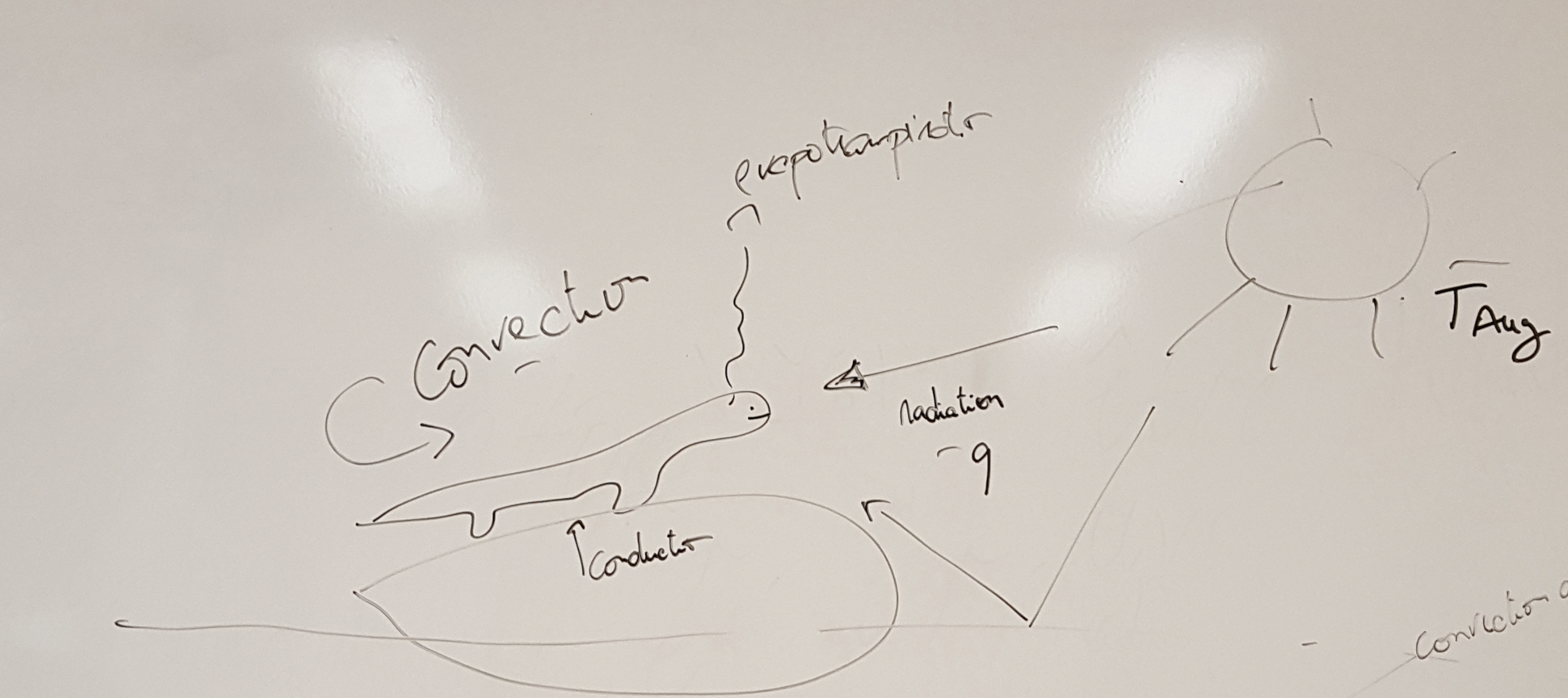
The total flow of energy into the lizard, also known as the heat exchange equation, can be written as \[f=q-k(b-a) \tag{1.1}\]
where
\(f\) is the energy flow (cal/h),
\(q\) is the quantity of heat in the solar radiation (cal/h),
\(k\) is the convection coefficient (cal/h/ºC),
\(b\) is the body temperature (ºC) and
\(a\) is the air temperature (ºC).
If the energy flow is positive, then the lizard is warming, while if it is negative then the lizard is cooling. The equilibrium1 happens when the energy flow is zero and so the the lizard is neither cooling nor warming. If we solve Equation 1.1 for equilibrium by replacing \(f\) with zero and expanding the right-hand side of the equation,
\[ 0=q-k\ b+k\ a \]
and rearranging for \(b\) we find the equilibrium body temperature that we denote with a hat,
\[ \hat{b}=q/k+a. \tag{1.2}\]
Let’s see if this equation makes sense. It says that the equilibrium body temperature is the sum of the solar radiation divided by the convection coefficient with the air temperature. So, at minimum the equilibrium body temperature is equal to the air temperature when the solar radiation is zero (e.g. during the night). But when the solar radiation is greater than zero then the equilibrium body temperature is higher than the air temperature as one would expect. How much higher? Well that depends on the convection coefficient. If the convection coefficient is very high then the body temperature is mainly determined by the air temperature. In contrast, if the convection coefficient is very low then the solar radiation can contribute significantly to the body temperature.
It’s time to start using R to explore this model. For instance, we can use R to plot the relationship between the body temperature and the solar radiation. First we create variables for the heat coefficient and the air temperature and assign some valuues:
We want to plot the equilibrium body temperature for a range of solar radiation values. So we create a vector with radiation values, for instance ranging from 0 cal/h to 1500 cal/h in steps of 500. I am going to use big letters to denote vectors in R code, in contrast with scalars which I will denote with small letters.
Q = seq(0,1500,by=500) #vector with radiation valuesNow we can write Equation 1.2 in R to produce a vector of the equilibrium body temperatures for each value of radiation.
B_eq = Q/k+a #vector with equilibrium body temperaturesLet’s examine the values of the vector, by binding the two vectors as a matrix,
rbind(Q,B_eq) [,1] [,2] [,3] [,4]
Q 0 500 1000 1500
B_eq 18 28 38 48This is nice as we can see the values of the equilibrium body temperature for each value of solar radiation. But let’s visualize this as a graph, by plotting these vectors in R,
plot(Q,B_eq,type="l")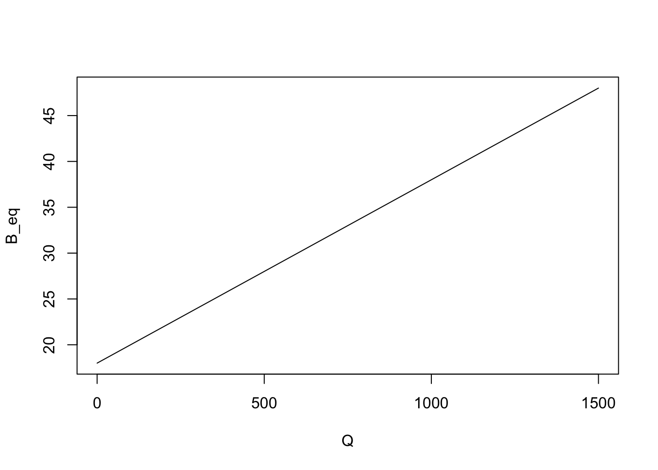
Note that we added type="l" as a parameter of the plot to have a line drawn instead of a sequence of dots in the plot.
1.2 Understanding the climate space
Another way of looking at the heat exchange equation Equation 1.1 is to look at what combinations of air temperature and solar radiation values are livable for the lizard. This is also known as the climate space of an organism. In order to explore the climate space of the lizard we need to first assess what are the maximum and minimum body temperature that the lizard can experience. Let’s assume those are respectively 36 and 24ºC and store them in R,
b_max = 36  #maximum body temperature (ºC)
b_min = 24  #minimum body temperature (ºC)
We now want to solve Equation 1.1 at equilibrium for the air temperature as a function of the solar radiation and body temperature. We can do this by rearranging Equation 1.2,
\[ a=b-q/k. \tag{1.3}\]
This equation can be then used in R to calculate vectors of the maximum and minimum survivable air temperatures for each value of the solar radiation in vector Q,
A_max = b_max - Q/k  #vector with maximum air temperatures
A_min = b_min - Q/k  #vector with minimum air temperatures
We can now visualize the climate space, this is, the combination of solar radiation and air temperatures in which the lizard can survive, by plotting these two equations (i.e. by plotting lines with x coordinates given by the vector Q and the y coordinates given by the vectors A_max and A_min),
plot(Q, A_max,type="l", #plots the maximum survivable air temperature
     xlab="Solar radiation (cal/h)", #adds x and y axis labels to the plot
     ylab="Air temperature (ºC)")
lines(Q,A_min) #adds line for the minimum survivable air temperature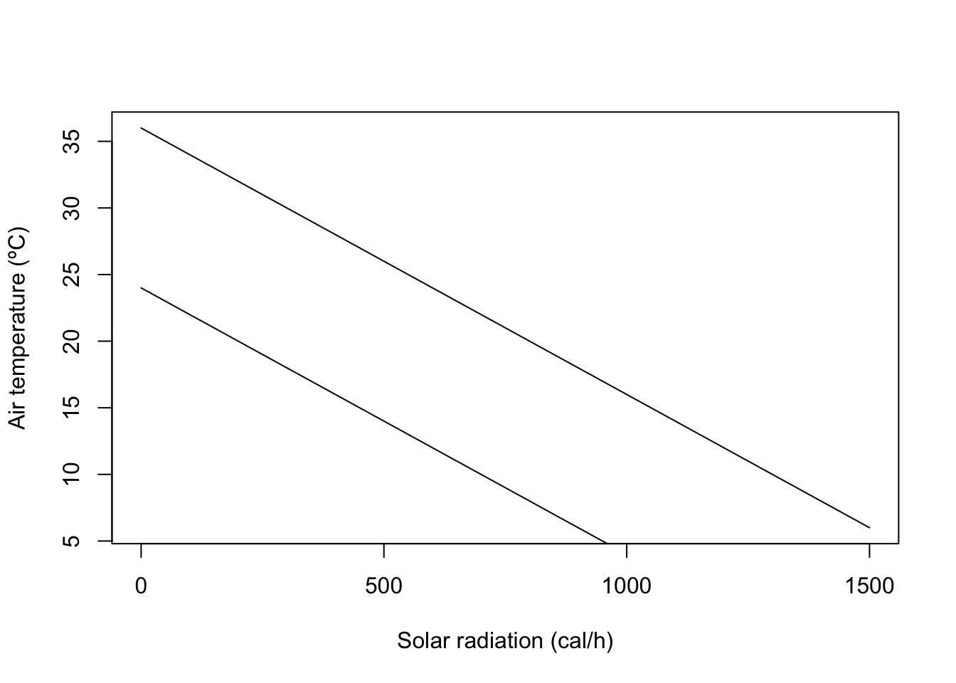
Let’s paint the area between the two lines which corresponds to the climate space of the lizard. We can use the R function polygon, to which we need to give the set of x and y coordinates delimiting the climate space as vectors. For instance, the upper lower corner can be the first coordinate, being 0 for the x vector and b_min for the y vector. The right upper corner is 1500 for x and b_max-1500/k for y.
X = c(0,0,1500,1500)
Y = c(b_min,b_max,b_max-1500/k,b_min-1500/k)
polygon(X,Y,col="green")
Now that we have the climate space we can plot on top of it some empirical data of how the conditions are in the field during the day. We can for instance consider two micro-habitats, a rock (in the sun) and a bush (in the shade). Suppose we obtain some data from temperature loggers that were installed in each micro-habitat , recording every three hours the values of temperature and radiation as tabled below.
| Time (hh:mm) | Radiation rock (cal/h) | Radiation bush (cal/h) | Temperature (ºC) |
|---|---|---|---|
| 00:00 | 150 | 150 | 18 |
| 03:00 | 150 | 150 | 13 |
| 06:00 | 800 | 450 | 10 |
| 09:00 | 1100 | 600 | 14 |
| 12:00 | 1300 | 650 | 21 |
| 15:00 | 1200 | 650 | 24 |
| 18:00 | 800 | 350 | 22 |
| 21:00 | 400 | 200 | 20 |
We can overlay these values of temperatures and radiations on the plot to understand which microhabitat should the lizard choose at each time of the day. First we create a vector for each column of Table 1.1. Note that we must enclose the times of the day in commas as they are strings. We also append at the end of the vector the values for 0:00 in order to close the lines (otherwise there would be a gap between 21:00 and 0:00).
#Times of the day
T = c("00:00","03:00","06:00","09:00",
      "12:00","15:00","18:00","21:00","00:00")

#Solar radiation in the rock habitat
Rock_q = c(150,150,800,1100,1300,1200,800,400,150)

#Air temperature in the rock habitat
Rock_a = c(18,13,10,14,21,24,22,20,18)

#Solar radiation in the bush habitat
Bush_q = c(150,150,450,600,650,650,350,200,150)

#   Air temperature in the bush habitat
Bush_a = c(18,13,10,14,21,24,22,20,18)
We overlay these vectors in the figure by invoking the function lines(Xcoor,Ycoord) for each micro-habitat. We add labels to each point to show the correspondence between each point and the time of the day.
lines(Rock_q,Rock_a,col="orange")
text(Rock_q,Rock_a,T)

lines(Bush_q,Bush_a,col="blue")
text(Bush_q,Bush_a,T)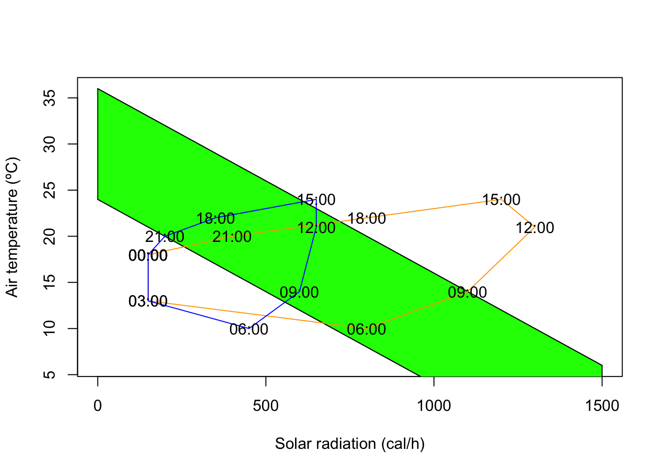
1.3 From ecophysiological models to species distribution models
In the previous section we developed a simple mechanistic model for the climate space of an organism. This is a micro-habitat level climate space. But one can also infer the climate space from the distribution of a species at the macro-habitat level. They are different but they are conceptually similar. The inference of such macro climate space is an area where species distribution models excel (for more on species distribution models check for example (Guisan, Thuiller, and Zimmermann 2017)). The idea is relatively simple. One starts with a bunch of locations of a species in geographical space. Then, one obtains the climate characteristics for those locations, and then plots those locations in climate space. The convex hull in climate space delimited by those locations is the macro-habitat climate space. What species distribution models (SDMs) learn to do is to delineate that climate space, this is, SDMs try to predict the probability of a species occurring somewhere in the climate space by learning from presences and absences from species. Then the SDM can extrapolate again what happens in geographical space, by predicting the species occurence probability for any point based on the climate data for that point. Without getting all the way into a full blown SDM, let’s try to follow some of the basics.
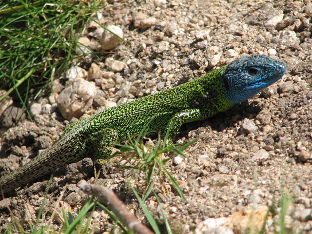
I will illustrate this with one my favorite species, the Iberian emerald lizard, Lacerta schreiberi, a species endemic to the Iberian peninsula, often found near water streams in mountain landscapes, but also in other habitats. First we obtain the presences for a species from GBIF (Global Biodiversity Information Facility, http://www.gbif.org). GBIF is a repository for biodiversity observations, and has over three billions of occurrences of over a million species all over the world at the time I am writing these words. Natural history museums, citizen science platforms such as iNaturalist ( http://www.inaturalist.org) and eBird (http://www.ebird.org), and scientists, publish their species records in GBIF using a data format called Darwin Core. There is a R package that allows one to download observations from GBIF and also other relevant geodata, the geodata package. We will be doing some geospatial processing, so let’s load also the terra package.
library(geodata)
library(terra)
library(predicts)
library(ggplot2)
We download the observations of Lacerta schreiberi from GBIF with the function sp_occurence(genus,species). We also download a world map with the function world(path), where path should point towards a local directory where we want to store the data.
occ <- sp_occurrence("Lacerta","schreiberi")
world_data <- world(path = ".") #download world countries limits
ext_eur <- c(-15,45,35,72) # coordinates of European extent
#download bioclim data
bioclim <- worldclim_global(var = 'bioc', res = 10, path = ".")
# plot the map of Europe
plot(world_data,
xlab = "Longitude", ylab = "Latitude", axes = TRUE, ext=ext_eur)
# add the species occurrences
points(occ$lon,occ$lat,cex=.1,col="blue")
# create pseudo-absences
eumask<-crop(bioclim[[1]], ext(ext_eur))
absences<-backgroundSample(eumask,nrow(occ),vect(occ),tryf=10)
points(absences,cex=.1,col="red")
# plot the climate variables in geographic space
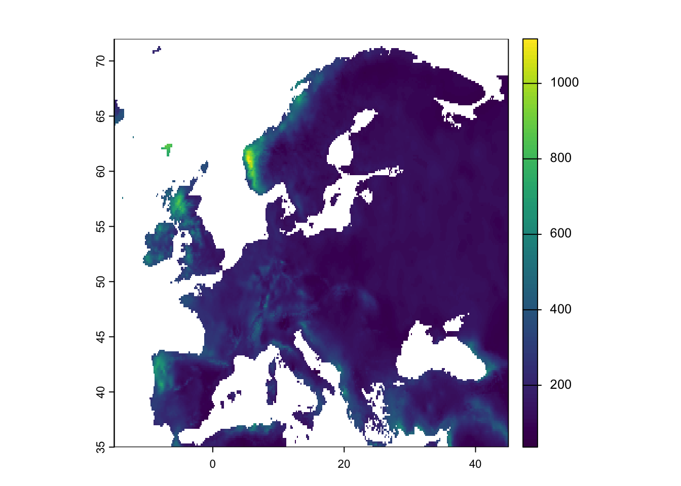
plot(bioclim[[19]],ext=ext_eur)
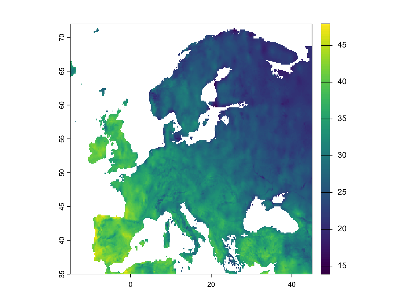
plot(bioclim[[3]],ext=ext_eur)
# plot the climate space figure
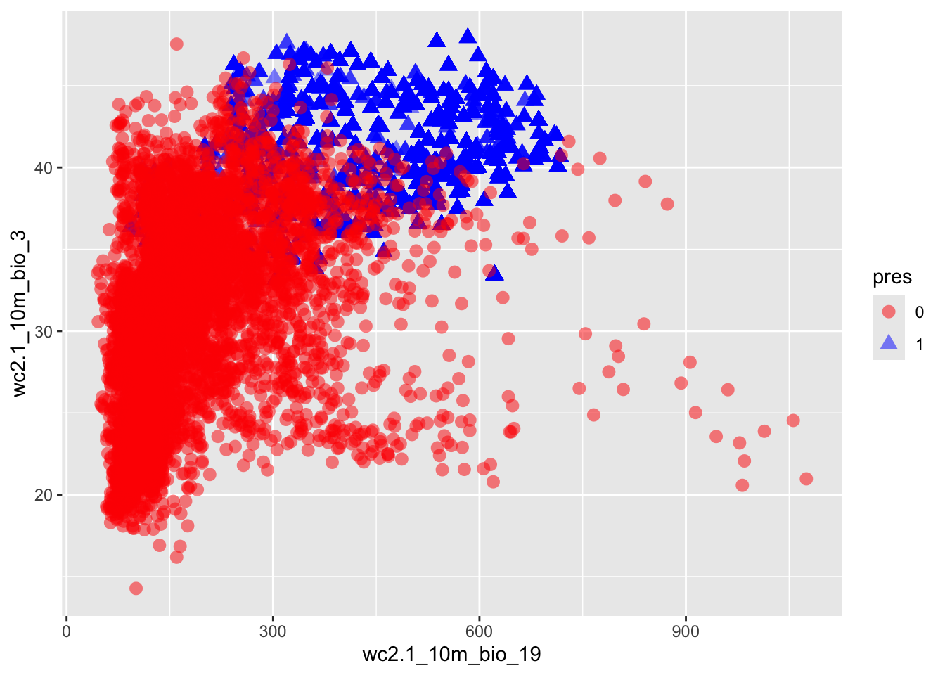
# first merge occurences and absences into a single matrix
allpts <- rbind(cbind(occ$lon,occ$lat,rep(1,nrow(occ))),
cbind(absences,rep(0,nrow(absences))))
colnames(allpts)[3]<-"pres"
# extract the climate variable values for all points
bioclim_sample<-extract(bioclim,allpts[,1:2])
allpts_bioclim <- cbind(allpts,bioclim_sample)
allpts_bioclim_plot<-allpts_bioclim
allpts_bioclim_plot$pres<-as.factor(allpts_bioclim_plot$pres)
ggplot(allpts_bioclim_plot, aes(x=wc2.1_10m_bio_19,y=wc2.1_10m_bio_3,shape=pres, col=pres)) +
geom_point(size = 3, alpha=0.5) + scale_color_manual(values = c("0" = "red", "1" = "blue")) 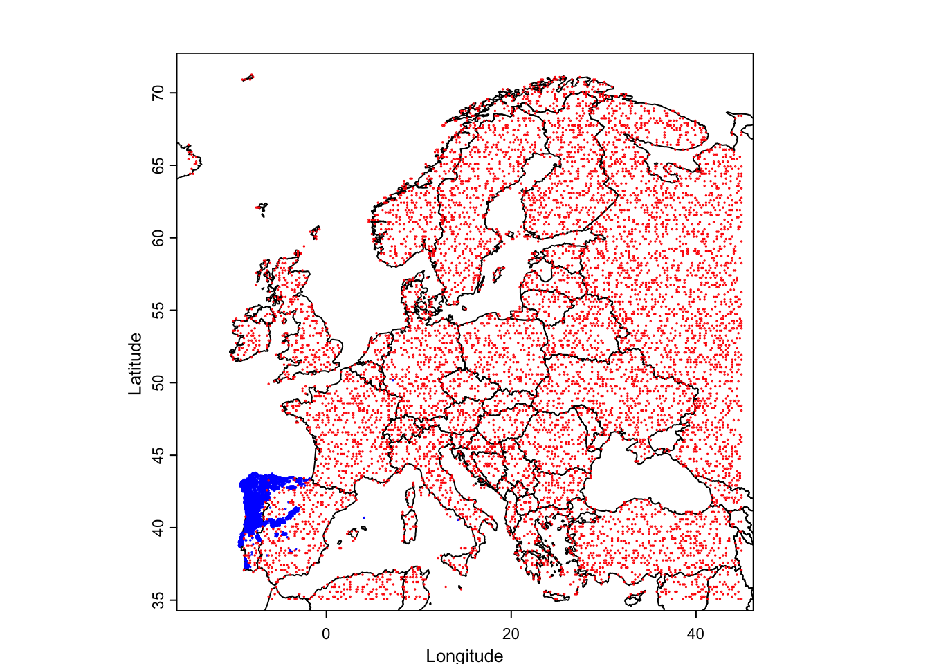
1.4 Statistical confrontation: regressing the climate space
By Andres Marmol
Why anoles? Anoles are among the most studied reptile organisms. They are vastly diverse with more than 488 species described until today — circa 11% of all the squamates without considering snakes — due to their outstanding adaptive radiation, which has inspired many to dive-in-depth into understanding how evolution has operated within this group (Lizards in an Evolutionary Tree by J. B. Losos (2009) is a highly recommended instructive reading for more info). As a result, very detailed data sets on many species of anoles, including information on micro habitat, field body temperature, activity patterns and morphological traits, performance, etc., can be found online in relatively few time.
In the following steps we will be downloading from Dryad and using a data set created by Winchell et al. (2016) on Anolis cristatellus making a pair-comparison of several morphological and thermal traits of individuals living in urban and forested areas at Puerto Rico. A. cristatellus is widely distributed across Puerto Rico and can be found in natural and human-intervened spaces easily. It can be seen over ground and laying on the trunks of trees in natural settings, and on walls and metal fences in more urban areas.
1.4.1 Calling the dataset from Dryad
To download the dataset, it is necessary to install the R package rdryad.
install.packages("rdryad")Then we open the newly installed package and download the dataset by specifying the DOI associated to this dataset.
#calling rdryad
library(rdryad)

# Specify the DOI
doi <- "10.5061/dryad.h234n"

# Download the dataset using the dryad_download function
downloaded_file <- dryad_download(dois = doi)
The data sets are now downloaded on the paths indicated in the box below, although for this exercise only table [2] winchell_evol_phenshifts.csv” is needed.
# The downloaded_file will contain the file path where the dataset is saved
print(downloaded_file)
$`10.5061/dryad.h234n`
[1] "/Users/henrique/Library/Caches/R/rdryad/10_5061_dryad_h234n/winchell_evol_CG.csv"
[2] "/Users/henrique/Library/Caches/R/rdryad/10_5061_dryad_h234n/winchell_evol_phenshifts.csv"Once this is done, it is always good practice to check if the recently open data frame works by checking the columns within the data frame.
#calling the dataset of interest as df
df <- read.csv(downloaded_file[[1]][2])

# checking the columns (variables) available in the data frame df using the str function
names(df)
[1] "ID" "date" "Site"
[4] "context" "perch" "bodytemp.C"
[7] "perch.temp.C" "ambient.temp.C" "humidity.percent"
[10] "perch.height.cm" "perch.diam.cm" "weight.g"
[13] "head.height.mm" "svl.mm" "local.time.decimal"
[16] "flags" "JL" "JW"
[19] "METC" "RAD" "ULN"
[22] "HUM" "FEM" "TIB"
[25] "FIB" "METT1" "METT2"
[28] "FL" "HL" There are 29 different variables within df, but this exercise will focus only in a few of them including context, perch, bodytemp.C, perch.temp.C, ambient.temp.C, and local.time.decimal where context indicates if the lizard was captured in natural or urban spaces; perch refers to the microhabitat where the lizard was found; bodytemp.C is body temperature \(b\); perch.temp.C is substrate temperature \(T_s\); ambient.temp.C is air temperature \(a\); and local.time.decimal is the time of the day in hours when the lizards was captured and measured.
1.4.2 Exploring the thermophysiological data of A. cristatellus.
As covered in the first chapter, \(b\) increases proportionally to \(a\) as indicated in equation (1.2). Let’s check if the data confirms this equation.
# to call a variable directly from a data frame one must use $, indicating the name of the dataframe at the left and the name of the variable (columnt on the right).

plot(df$ambient.temp.C, df$bodytemp.C,
     xlab="air temperature (°C)",
     ylab="body temperature (°C)")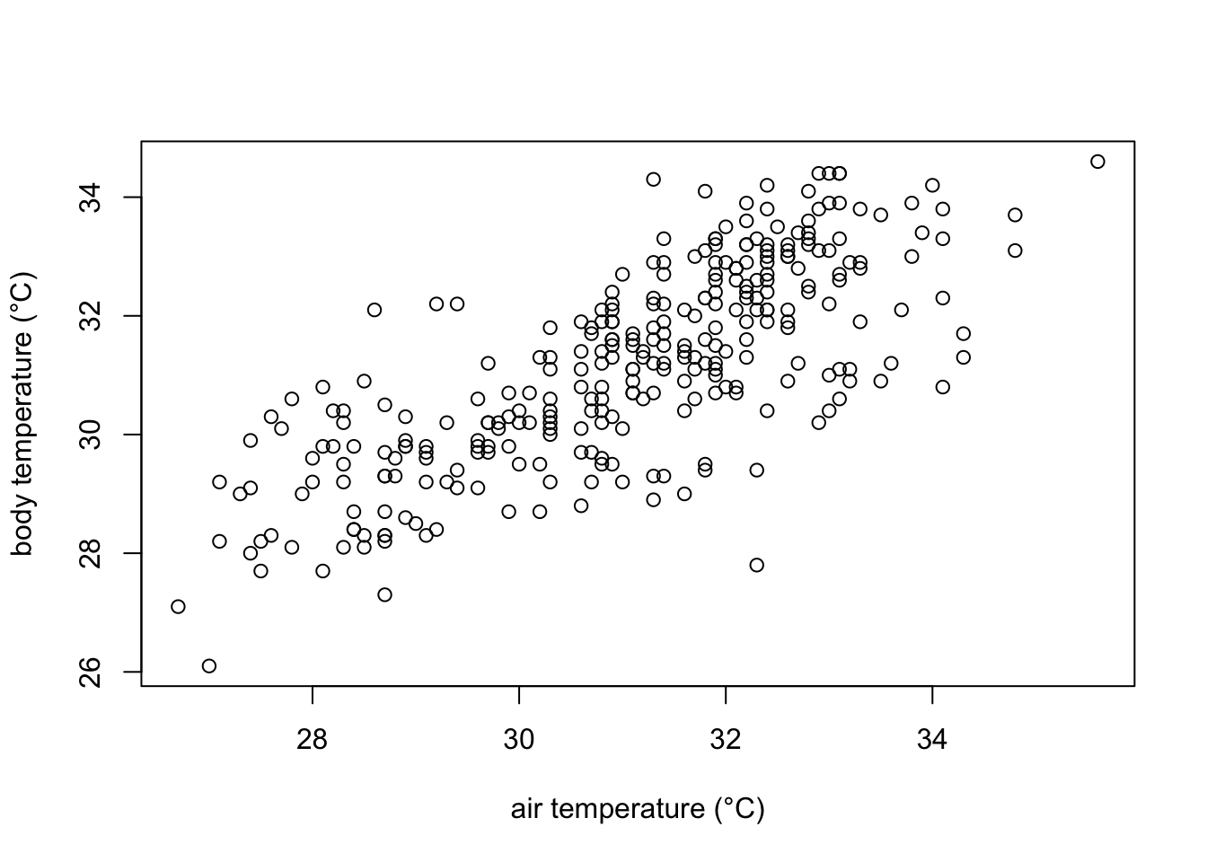
In the plot we can observe that indeed body temperature increases with increasing temperature. However, we cannot quantitatively know how much is this increase. For that, we can model how air temperature affects body temperature modelling them a a line with the equation:
\[ \hat{y} = α + β*x + e \] where \(\hat{y}\) is the predicted value of \(y\) for any given \(x\); \(α\) is point of intersection of the line when \(x=0\), \(β\) is the slope of the regression line (i.e. how much increases \(\hat{y}\) with a unit increase in \(x\)) and \(e\) is the random error.
Placing our variables in formula, it would look like this:
\[ b = b_{0} + β*a + e \]
where \(b\) is body temperature, \(a\) is ambient temperature, and \(b_0\) is the body temperature when \(a\) is zero.
Now lets model it using a least-squares linear regression using the lm function in R.
#define the linear model
#the variable at the left of the tilde (~) is the dependent variable
#data calls the specific dataframe to be used.

model1 <- lm(bodytemp.C ~ ambient.temp.C, data=df)

# print model outputs
print(model1)
Call:
lm(formula = bodytemp.C ~ ambient.temp.C, data = df)

Coefficients:
   (Intercept)  ambient.temp.C
        8.7004          0.7237
1.4.3 Interpreting the results of our model.
The results of our model indicates that if the air temperature (\(a\)) is zero, A. cristatellus would show a body temperature (\(b\)) of 8.7 °C, which increases in approximately 0.7 °C for each 1 °C increase in air temperature.
Now it is also possible to draw a few predictions
# a number of possible ambient temperatures that can be found in Puerto Rico during the day

amb_temps = data.frame(ambient.temp.C = seq(27,38, 1))# defines a vector with values from 27 to 38, with one unit increase

predict(model1, newdata=amb_temps)
1 2 3 4 5 6 7 8
28.23967 28.96335 29.68702 30.41070 31.13437 31.85805 32.58172 33.30540
9 10 11 12
34.02907 34.75275 35.47642 36.20010 1.4.4 How good our model is performing?
Graphically the linear model fits the data as follows:
# Create the scatter plot
plot(df$ambient.temp.C, df$bodytemp.C,
     xlab="air temperature (°C)",
     ylab="body temperature (°C)")

# add the line of fit from our recently created linear model "model1"
abline(model1, col = "red", lwd= 2)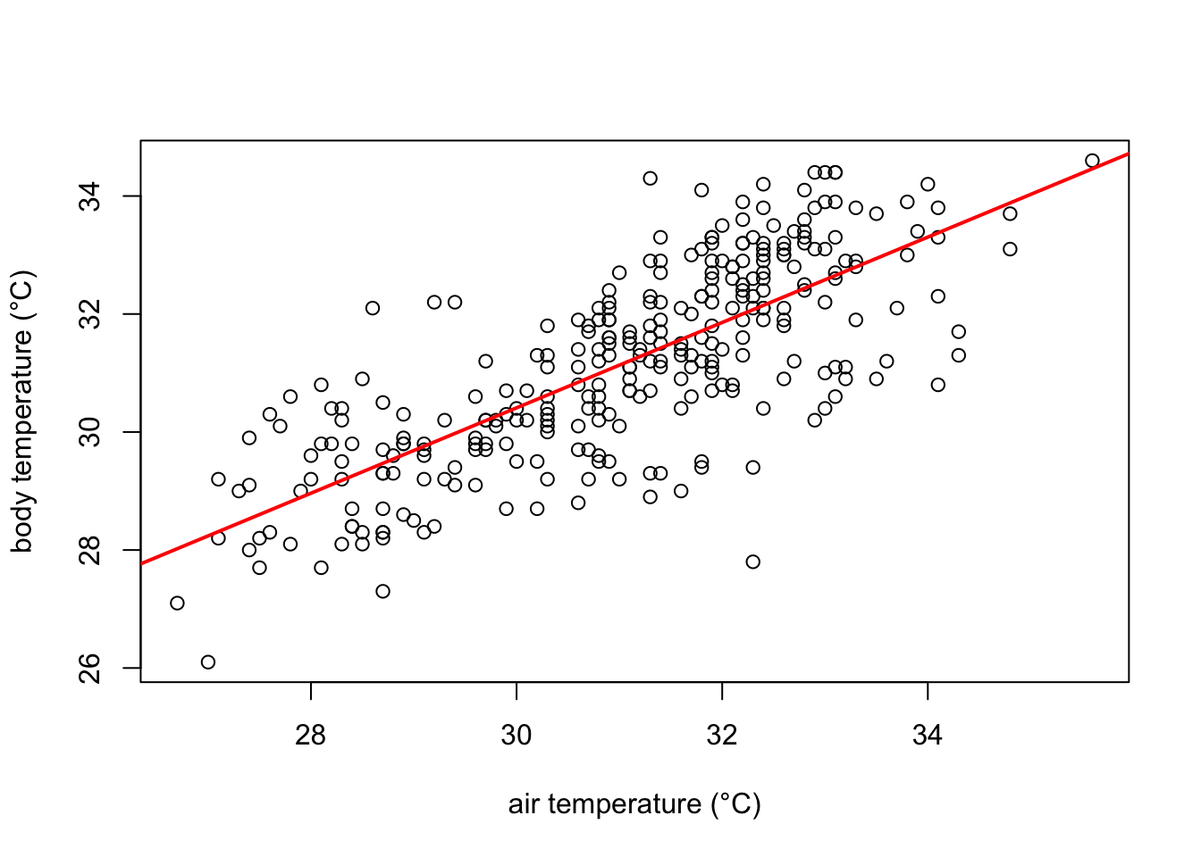
The red line in the plot follows very well the pattern of increase shown by our data. It is noticeable, however, that some points fall farther from the line of best fit than others. In other words, many \(\hat{y}\) values (body temperature) are predicted with larger errors than others, for a given \(x\) value (ambient temperature). These errors are also known as residuals, and are the vertical distance between the observed values and the line of best fit. They are graphically represented in green in our plot:
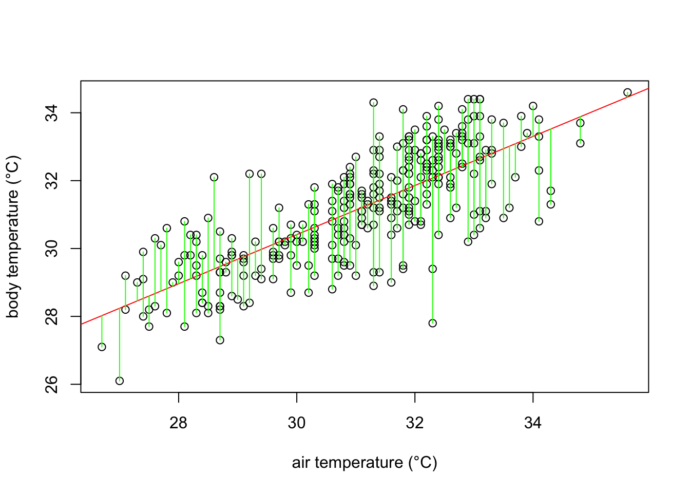
What a least square linear regression does is to find the lowest sum of squares of the residuals (every green line in the plot) so that the least amount of error is kept in the linear model.
Finally, how well the model fits the data? In our example, the body temperatures do not perfectly fall on the line of best fit, and many of them are scattered around it. A common metric assess this question in a simple regression model is the \(r^2\). \(r^2\) values indicates how much of the variance of body temperature (our dependent variable) is explained by ambient temperature (our independent variable). A perfect fit is indicated by an \(r^2\) of 1, while no fit would be zero. To check the \(r^2\) in our model we can simply use the summary function in R.
# obtaining the r-squared of our model

summary(model1)$r.squared
[1] 0.5736088\(r^2\) equals 0.574 indicating that almost 60% of the variance in body temperature is explained by ambient temperature.
In summary, our expectation that lizards body temperature increases depending on how the temperature in their environment changes has been confirmed. Specifically for A. cristatellus in this study, body temperature increases ~ 0.7 °C every 1 degree increase in air temperature. A few questions remain. For example, does habitat has an effect in the body temperature in A. cristatellus, and if it does, how different could the body temperatures of the lizards in habitat A are from those in habitat B?
The concept of equilibrium is very important in ecological theory. It is often introduced in the context of differential equations and corresponds to the point at which the derivative of the variable of interest is zero. The heat equation can also be seen as a differential equation where \(f\) corresponds to the derivative of the amount of heat \(Q\) in the lizard through time \(t\), i.e. \(dQ/dt\).↩︎